The
backgrounds of
BAD TIMING
A brief tutorial on colouring your image, Bad
Timing style.
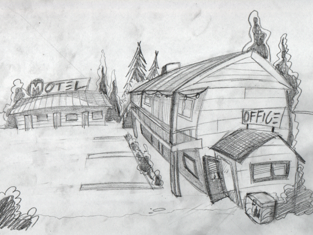
This tutorial doesn't teach you how to draw. There are lots of tutorials and lessons for that available on-line, in the bookstore or in the library. The purpose of this tutorial is to show you how I colour and touch up my already drawn work. The first thing I do, after deciding what scene I need, and what objects need to be in that scene, is drawing a sketch of the scene on paper. The sketch below is one of a Motel. This scene won't be included in the game, because it didn't fit into the story anymore after I changed the story.
Anyway, after I'm satisfied with the design, I use my scanner to put the image up for editing in Paintshop Pro 7.

Bad Timing's backgrounds are drawn in a resolution of 640x480. So the first thing I do is resizing the sketch to that resolution. Now we can start colouring the thing. I always use a lot of different layers for different parts of the image. For example, a different layer for the walls, another layer for the roof, another layer for the ground and the sky, etc...
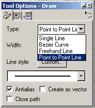
The tool I mostly use for colouring is the Draw tool. By default, the type of line is set to single, but I don't use that one much. Therefore we need to change it to Point to point line, as shown below:
 |
While you're still in edit mode, the selection won't be filled. This means you can always edit the way the lines run by moving the nodes around. When you're done, right-click and select Quit Node Editing. Voila, the area inside the lines is filled with the selected colour.
|
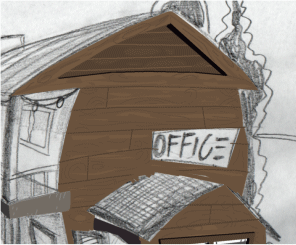 |
The next thing I do is adding little bits of detail. Nothing spectacular, and very unpolished. Just to get a rough idea. I also cut out the part where the office sign needs to be. A fine example of the the convenience of layers. I used the lasso tool for this. By default the selection type is set to freehand. I set it to point to point. Then I brought the opacity of the layer down to 30% to see where the sign on my sketch is supposed to be. Now you can trace the lines of the sign to select the part you want to cut out. This works kinda similar to the draw tool we used. Just point and click to select the location of where you want to start a line from and point and click again where you want it to end. Make sure you have anti-aliasing turned on, our the cutout will have those sharp pixely edges. Well, I applied the mentioned techniques to colour a lot of the objects on the sketch, as shown below. The round objects (lamps, M sign, some of the bushes) were drawn with the preset shapes tool. I selected the ellipse tool and turned off the retain style and vector options.
|
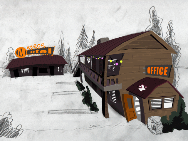
The trees are on another layer. This time I created a layer beneath the layer on which I've drawn the building. Again I used the line tool, but for some of the trees I used the freehand option instead of the point to point option. The freehand option is simple; just hold the mouse button, trace the lines, and release the mouse when you cornered the area you want to fill. As you can see, the shadows are inspired by styles used in classic adventures such as Sam and Max and Day of the tentacle. The trees, for example, are first drawn in a light shade of green. Then I select a darker shade and using the same tool I draw over the tree again, leaving only a few parts uncovered.
I also made the signs and the lights glow, using a standard paint brush. I paintbrush it on a different layer, and turn opacity of that layer down to approximately 80%. The ground was also drawn with the paint brush. I made it blue-ish first, and then applied a bit of green here and there. (see image below) I also added little details again.
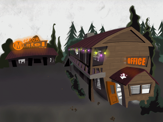
The next thing I did was creating another layer again, this time beneath the layers on which I've drawn the building, ground and the trees. I used the paint bucket to fill it black. The stars are made with the line tool set to single line. Clicking on a spot will then create a antialiased dot. Clicking twice on the same spot creates a somewhat bigger and brighter star. Variety is the key. I also used PaintShop's own stars which you'll find in the paint brush tool, under custom Brush. I don't use these custom brushes too often, because they're not exactly original and people will notice. There are custom brushes of leaves available too, which I used on some of the plants on this image (They're not hard to spot).
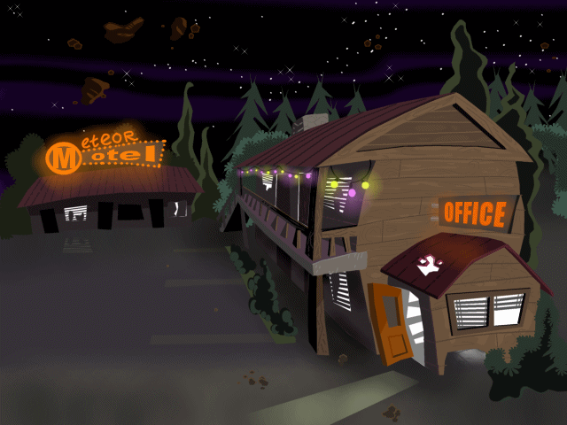
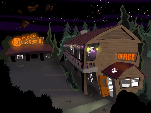
To increase the illusion of depth I put in some foreground objects on a different layer. The bushes on the left are made with the custom brush again. The foreground objects also frame the image nicely, as you can see below.
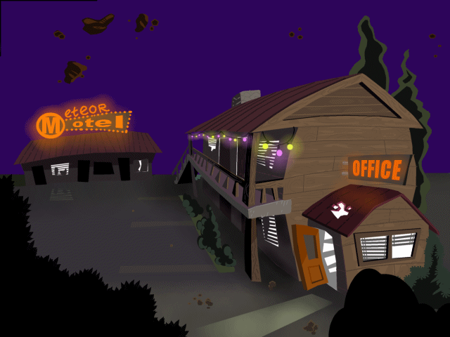
There are more tricks to increase depth. Objects in the distance are often a bit hazy. In this case I want to apply this effect on the trees, as these are the objects in the distance. Luckily I created the trees on a separate layer. What I did was creating another layer, between the layer on which I drawn the house and the layer on which I drawn the trees. I fill this layer with a nice shade of dark-ish purple, the colour of a dark 'night time' sky. The purple is overlapping the trees, but behind the house. Perfect.
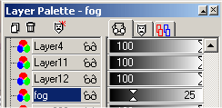 |
Next thing I did was decreasing opacity of this purple layer to 25%. The result is shown below: As you can see it looks like the trees are more in the distance than they were before. |

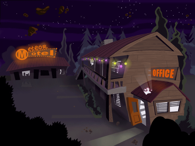
The final image is shown below. I added more detail and applied shadows. The shadows are on different layers and I used the paintbrush tool (colour black) to create them. I often change the opacity of these 'shadow' layers to soften the shadows, or to make them stand out more. Just play around with opacity to see what looks best. I also added a layer on top of everything, except the black foreground objects, and filled it with a medium-dark shade of purple. I set the opacity to 10% to give everything a very slight purple colour to enhance the feeling of night.
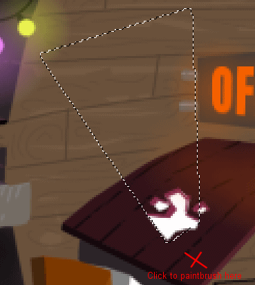
The ray of light coming out of the hole in the roof was made with the paintbrush tool as well. I made a selection in the shape of the ray with the lasso tool set on point to point. Then I clicked once with the paintbrush tool (white colour) on the spot where the light is supposed to come from. In this case, the hole. The paintbrush will only be applied inside the selection, thus creating the effect of a ray. Again, make sure you have anti-aliasing on when using the lasso tool. (see images below)
That pretty much sums up a few of my most-used techniques. I must say this is a very brief explanation and it doesn't cover nearly everything. I also didn't mention any techniques on perspective, shadows, contrast and such. You'll have no problem finding them on-line, I'm sure. I hope this was kind of useful. If you have any questions, be sure to ask them on our forums. I might even update this tutorial to explain further questions.
The result as shown here took me 1 day, drawing the sketch included. The next day I polished the image and again I added more detail, corrected mistakes, etc. This took me 3 hours. You'll often find that one day later an image can look entirely different. You often find mistakes you didn't see the day before so it's a good idea to take a break and finish the image a day later.
Erwin Broekhuis.
(version 1.0, 03-07-04)